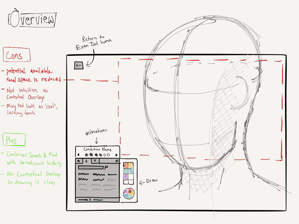
Overview
Rendia is a medical software company that builds tools for Optometrists, Ophthalmologists, and Otolaryngologists. I was the sole designer for two products:
1. a Netflix-like web site that let doctors play videos in their waiting room, exam room, or on social media.
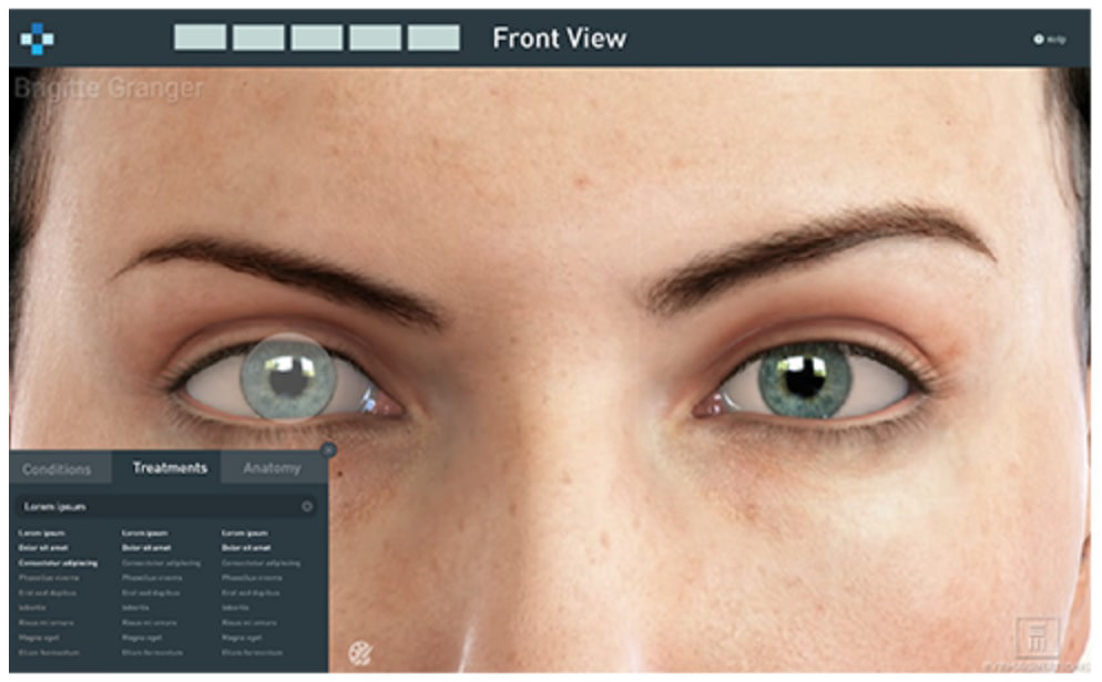
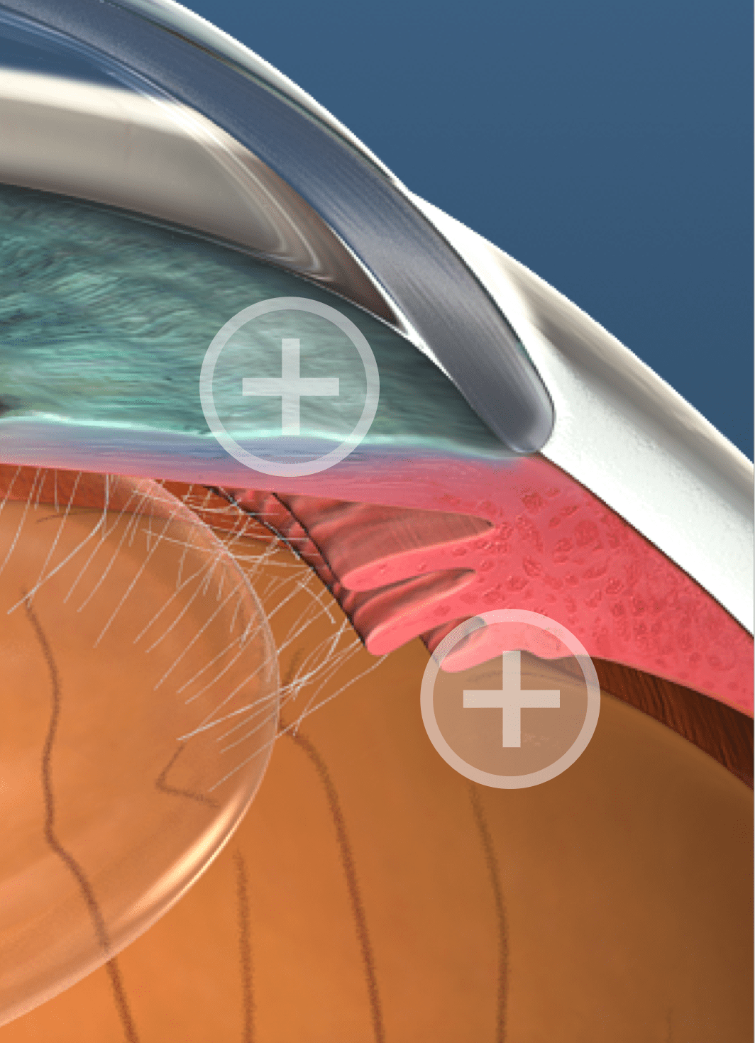
2. Exam mode (this project): A a web app and native iPad app that allows doctors to navigate through the human body, visualize conditions, and communicate treatments to their patients.
Role
I was the only designer but worked closely with a project manager and a small team of web and iOS developers. I spoke to our sales team, customer support team, and the doctors themselves to understand what our users needed from this product. I then produced a variety of sketches, mockups, and prototypes, performed remote moderated usability tests, and a few rounds of iteration focused on improving the product.
Problem
From direct observation we noticed a few issues doctors had with using Rendia in the exam room.
Providing context was challenging—the videos helped but the screen was usually obstructed by the doctor's hand
Significant effort—a playlist for a certain condition and treatment needed to be created prior to the
appointment, which many doctors didn't have the time to do
appointment, which many doctors didn't have the time to do
Technical hiccups—doctors are intelligent, but not very proficient with computers/technology
We defined success of the product as:
Quick—Doctors were using this tool in the exam room, so with limited time, they needed to articulate a patient's condition and move on
Smart—Doctors couldn't waste time finding the right video and needed the appropriate content in a timely manner
Interactive—Doctors told us they wanted to look "cool" (their words). They were moving away from plastic models and towards screens and iPads
I also designed other design elements such as the logo, product advertisements, and promotional video animations
Research
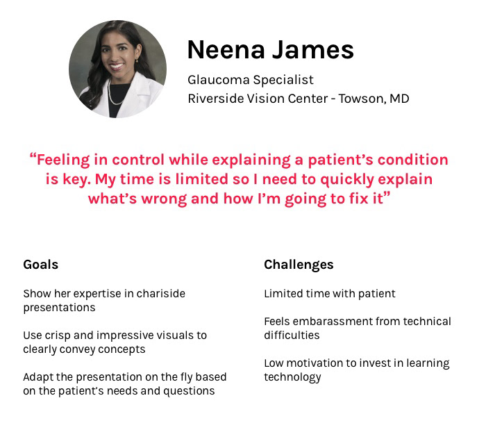
Using insight I gained from speaking with a few practices and stakeholders, I created a persona that covered their goal and what obstacles they faced.
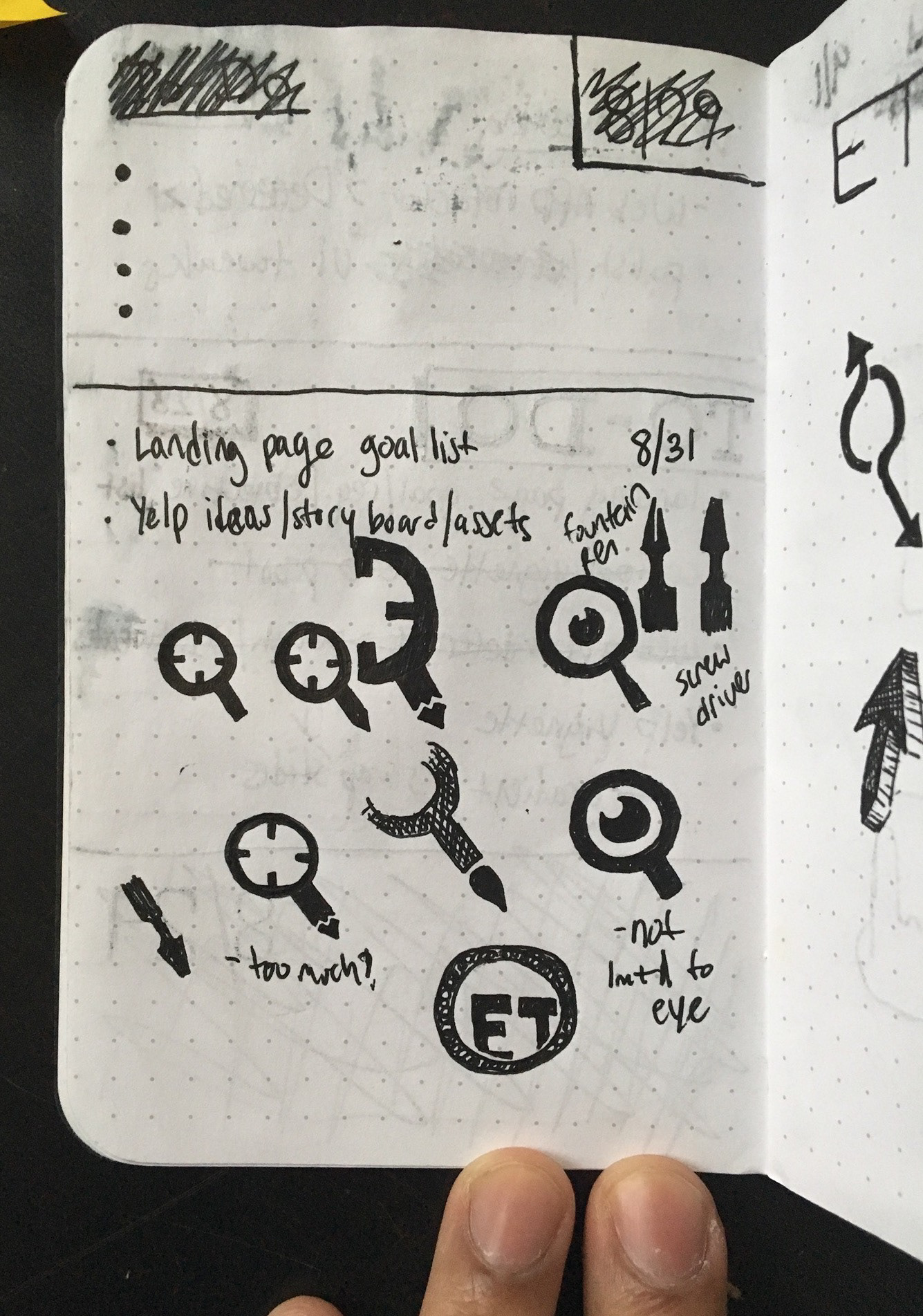
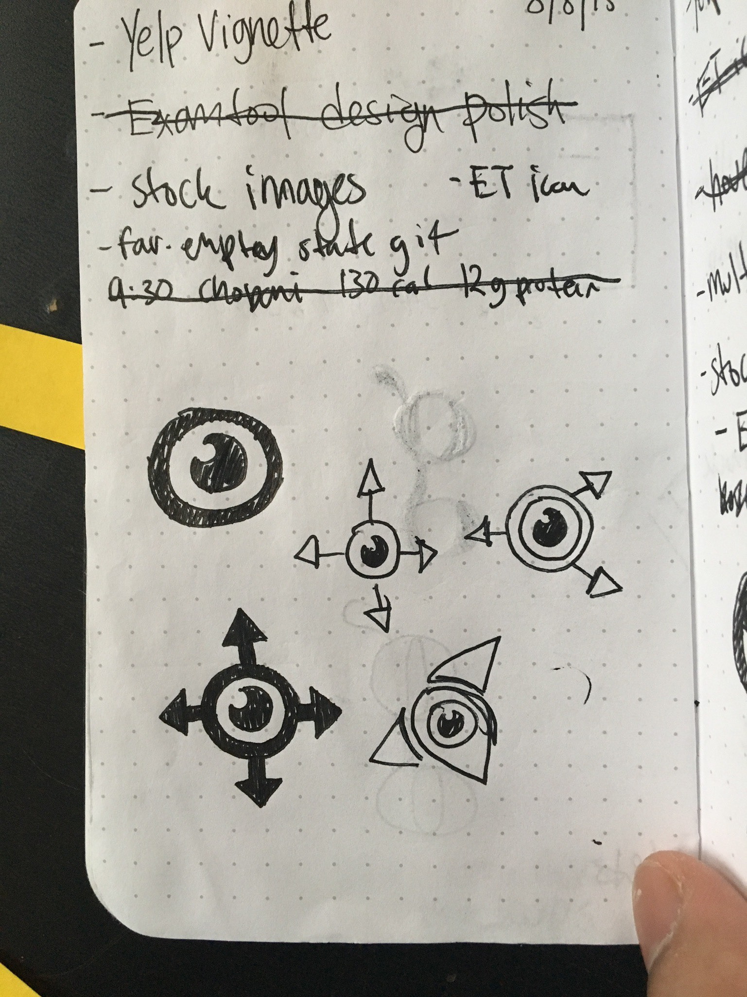
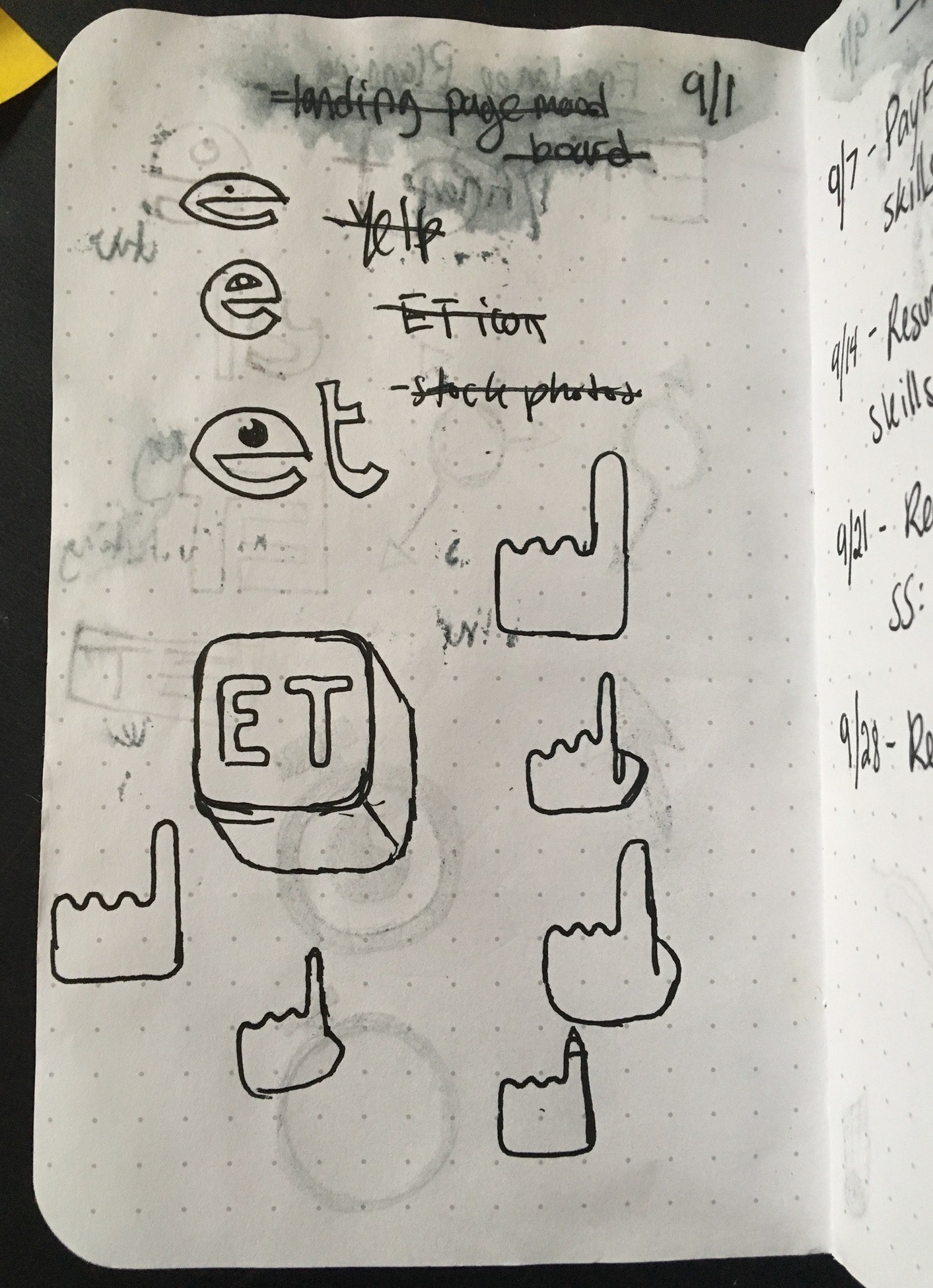
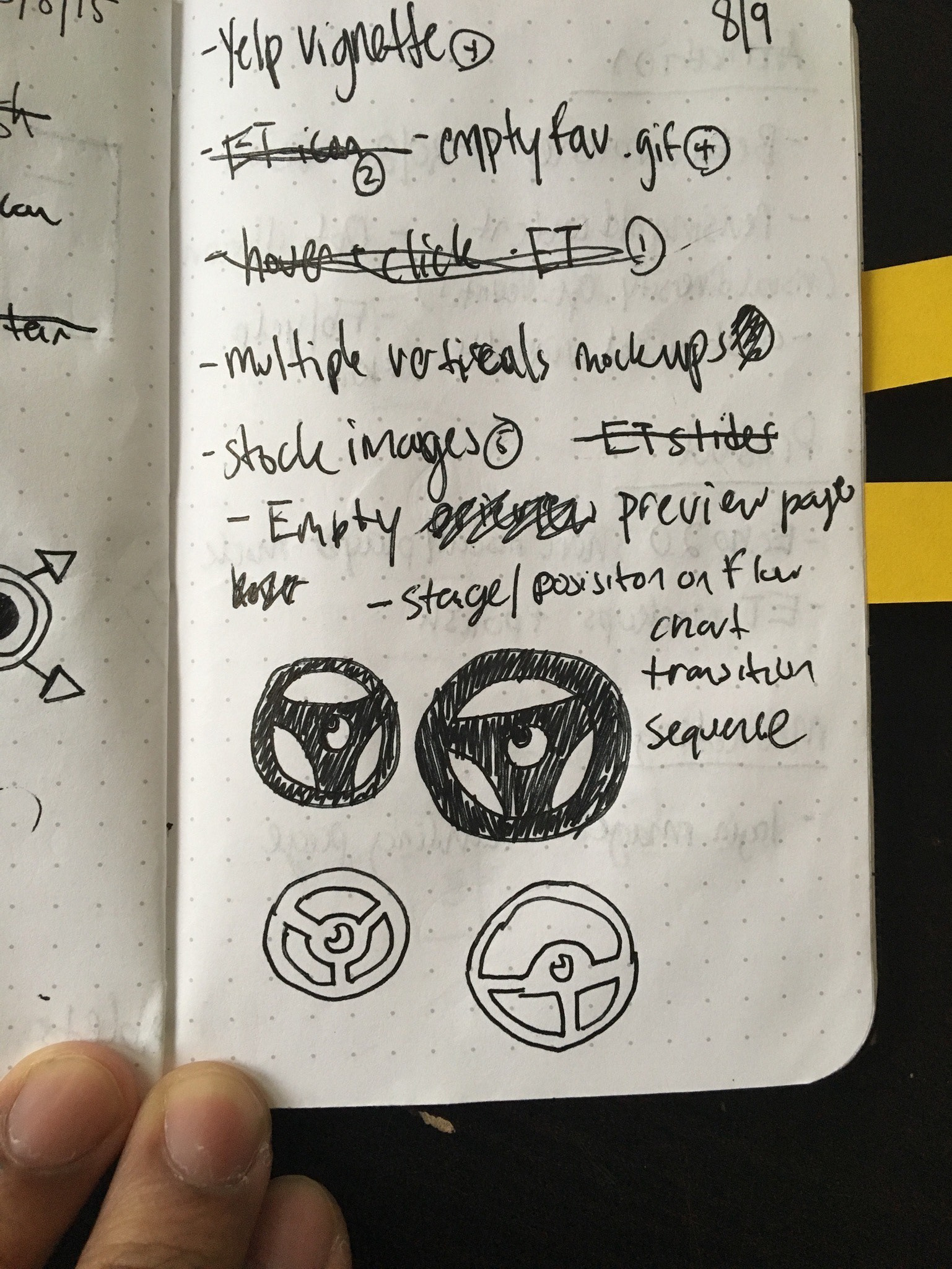
Sketches
It was difficult to find parallels to our product so I explored a lot of ideas in low-fidelity and
received feedback before moving forward.
Designs were impacted by constraints which created a few conflicts:
Screen size and device—Although we decided not to focus on phone-sized devices and portrait orientation on the iPad, our interface still needed to work on multiple resolutions
Patients have a hard time seeing—Not only did patients have difficulty focusing on a smaller device or screen, they also had eye problems so our content needed to be as visible as possible
Touch inputs varied—Whether it was with a mouse cursor or a finger, our navigational system needed to be easy to use and accessible
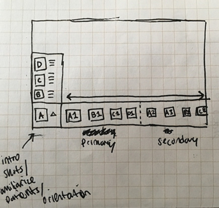
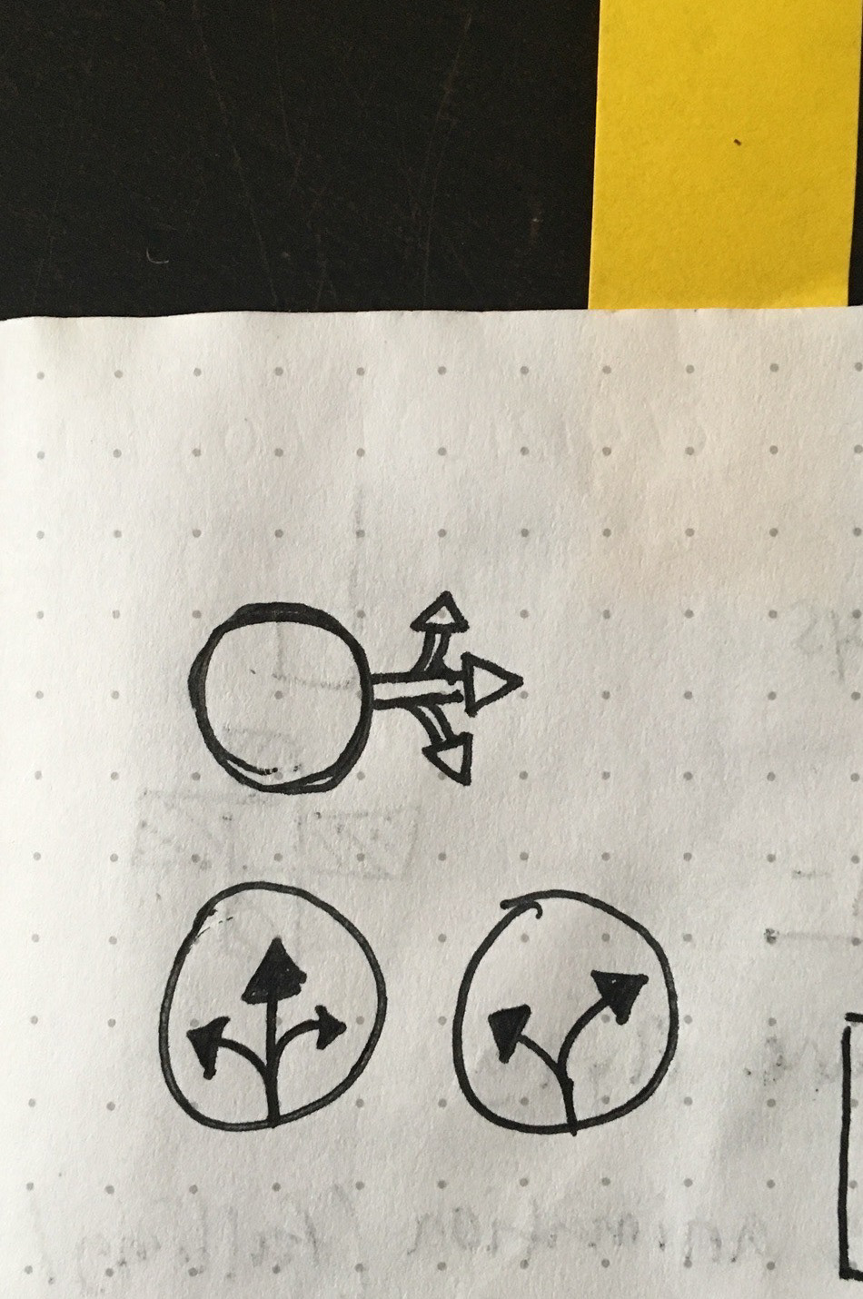
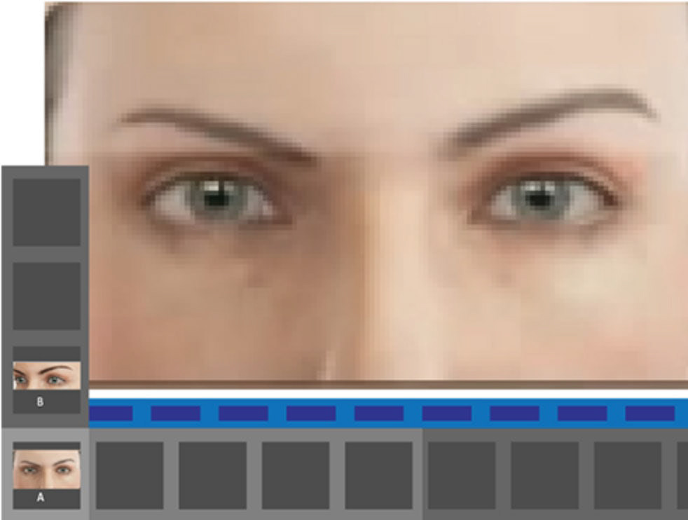
An idea that didn't make the cut
One of the ideas for navigation that I originally explored was a small modal docked to the bottom-left of the screen.
I used a sketching iOS app called Paper to quickly jot down notes, ideas, and sketches
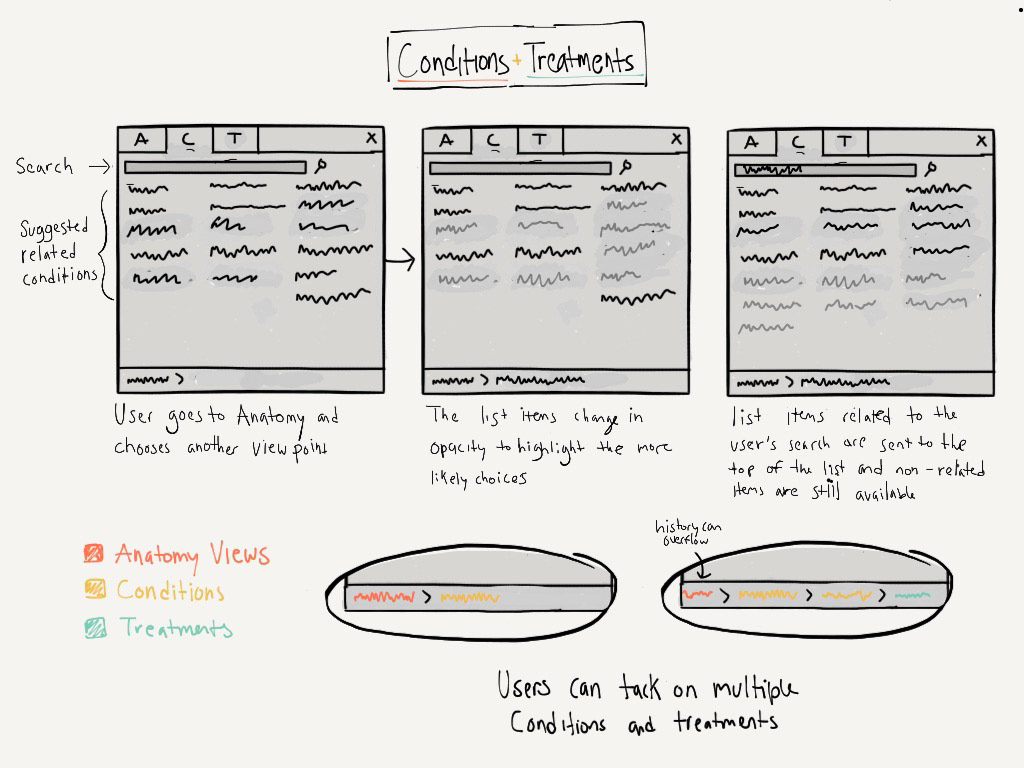
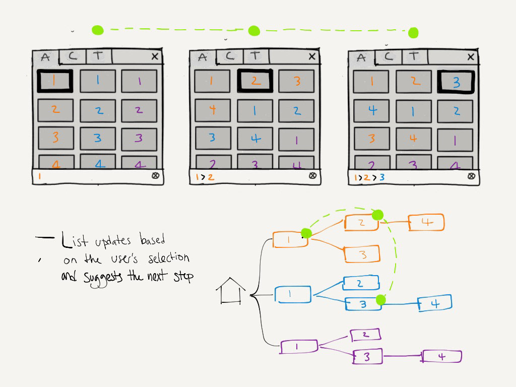
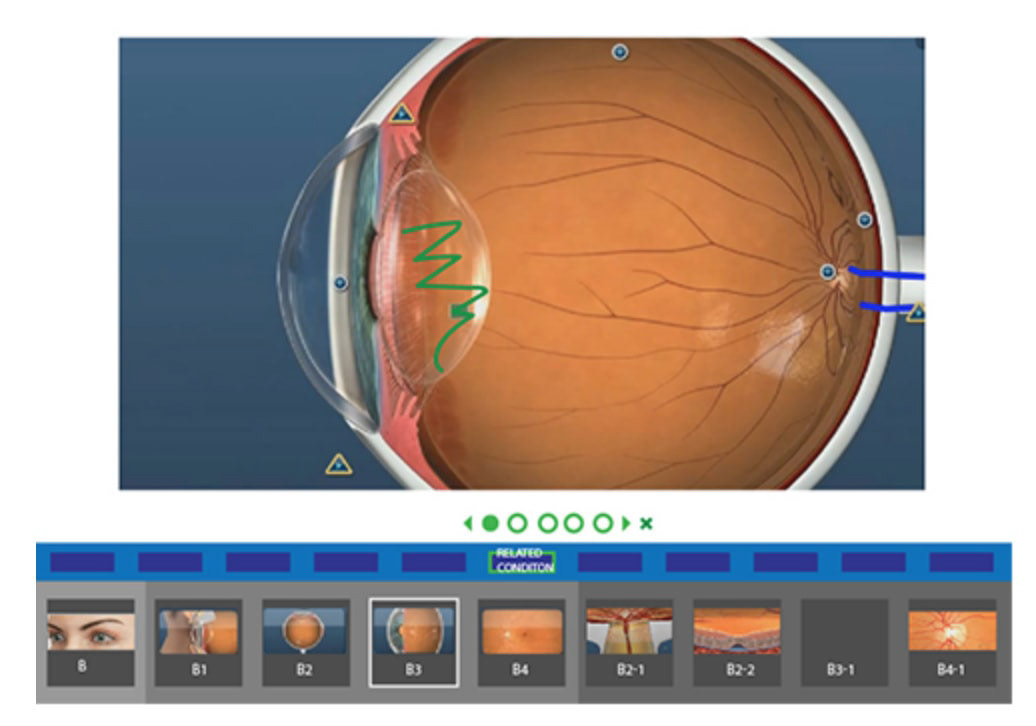
The menu contains a grid of items that constantly updates based on your recent selection, to show you parts of the anatomy that are connected to your current view—which would likely be your next decision.
This idea didn't work because it obstructs too much content and requires doctors to focus on a very small portion of the screen. It also made the viewing area considerably smaller, especially on an iPad. Although we didn't run with this interface, we incorporated the 'smart' navigational concept into our final design.
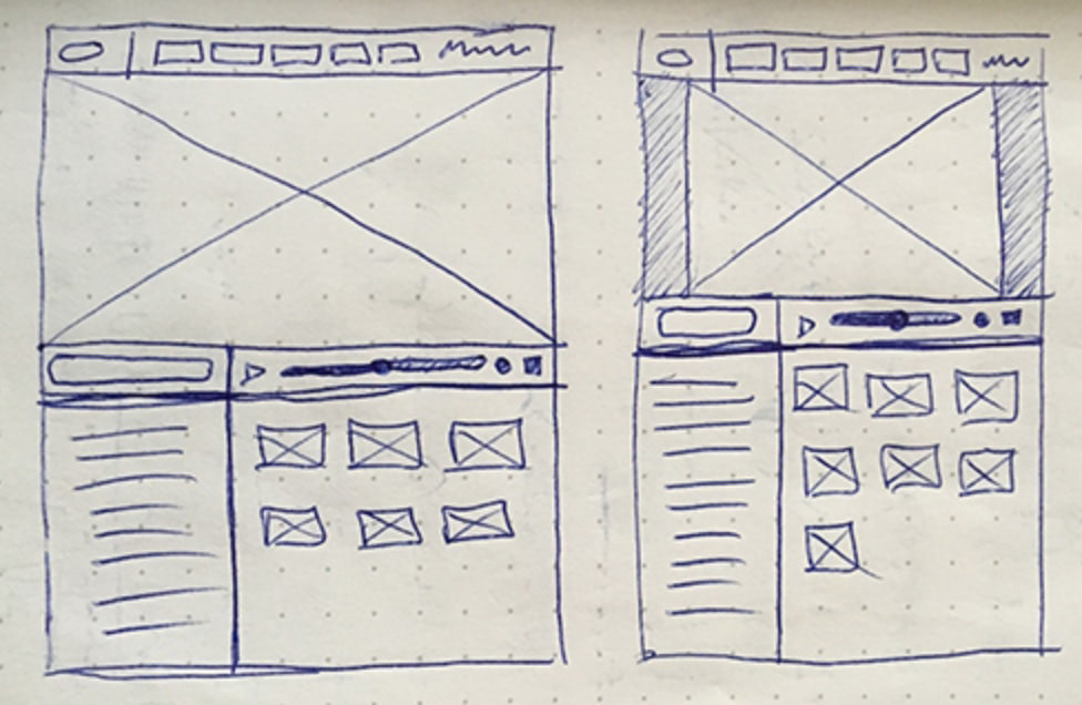
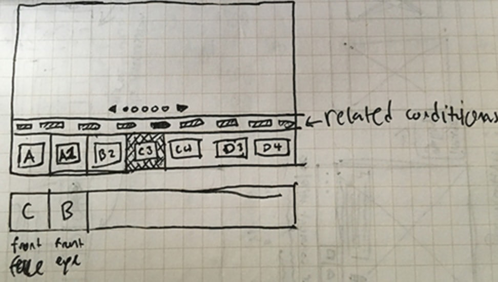
Mockups
I used Sketch to continue exploring ideas and created designs used for testing and communicating functionality to the team. These static designs were used to create clickable prototypes that simulated common user flows.
In addition to a bottom-left dialog box, I proposed a horizontally sliding navigation. However we quickly learned that this type of menu wasn't suitable for the amount of content we needed to communicate: many thumbnails of anatomical views but even more conditions and treatments.
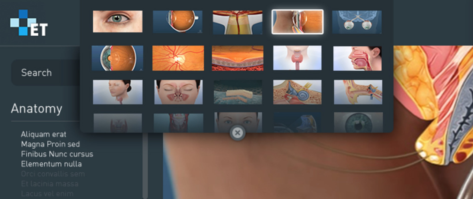
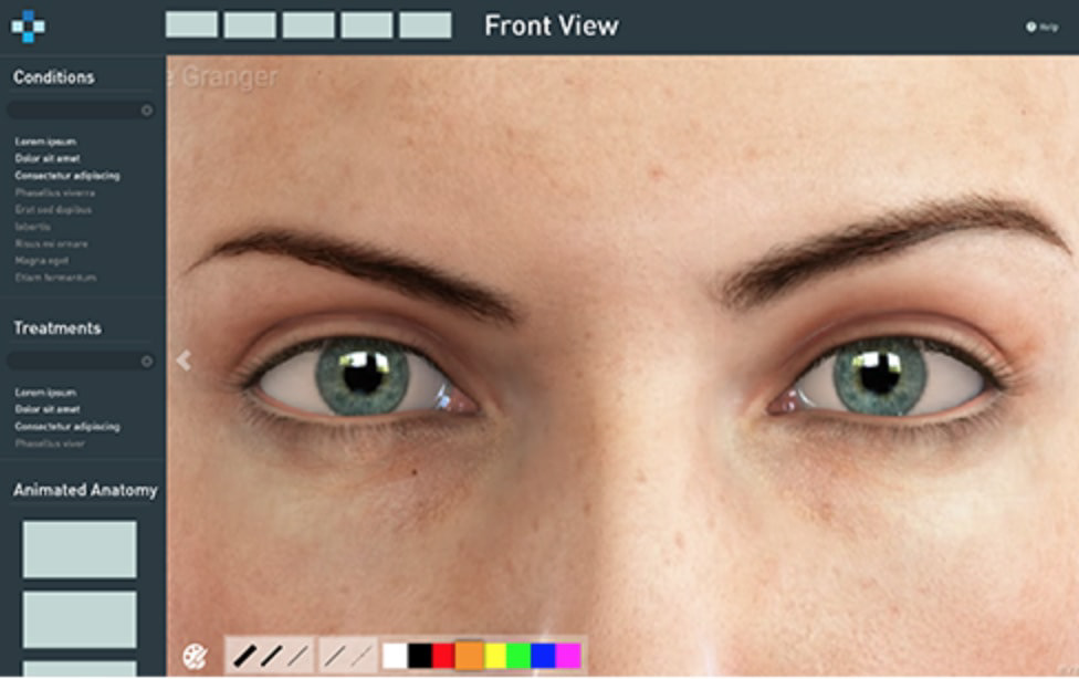
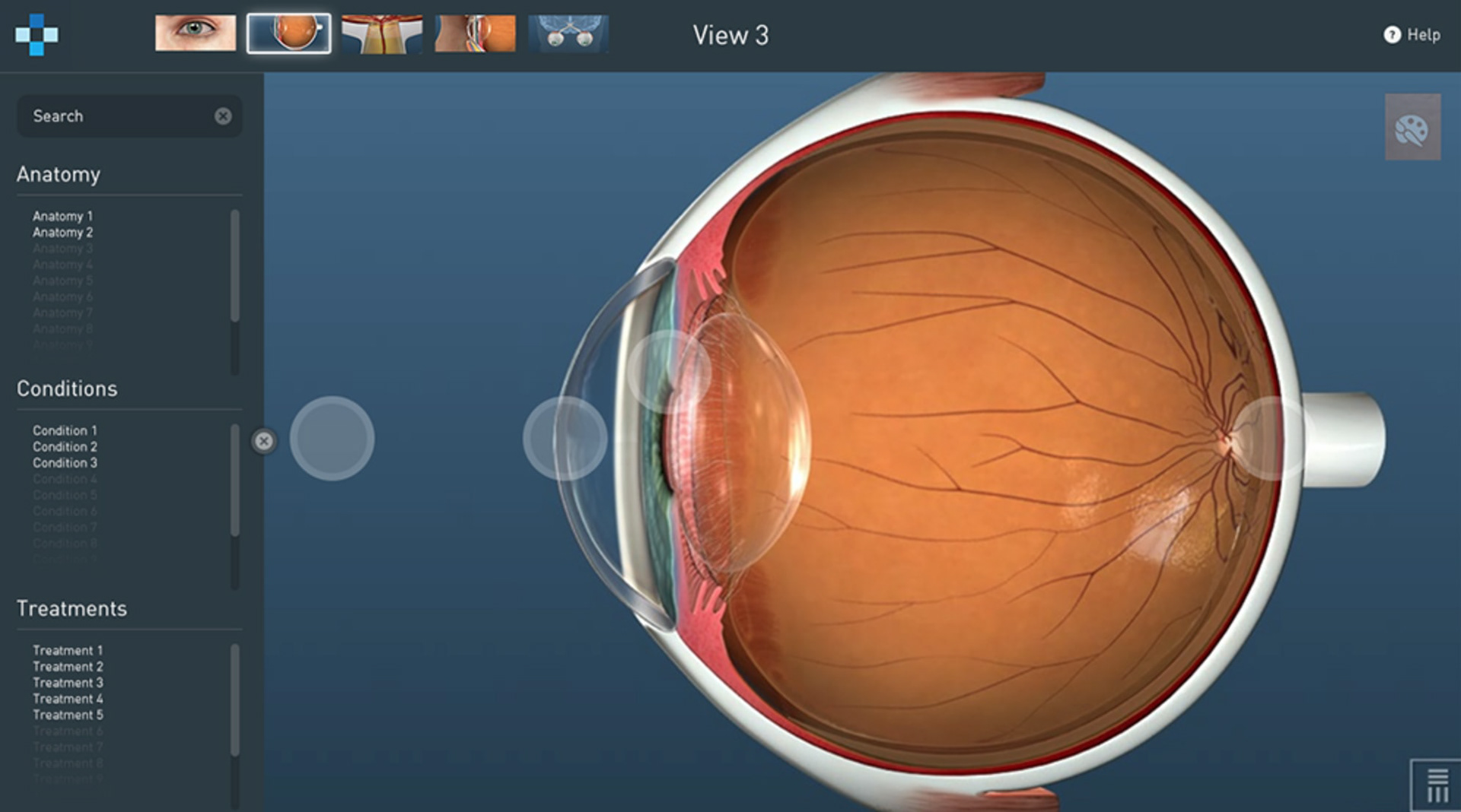
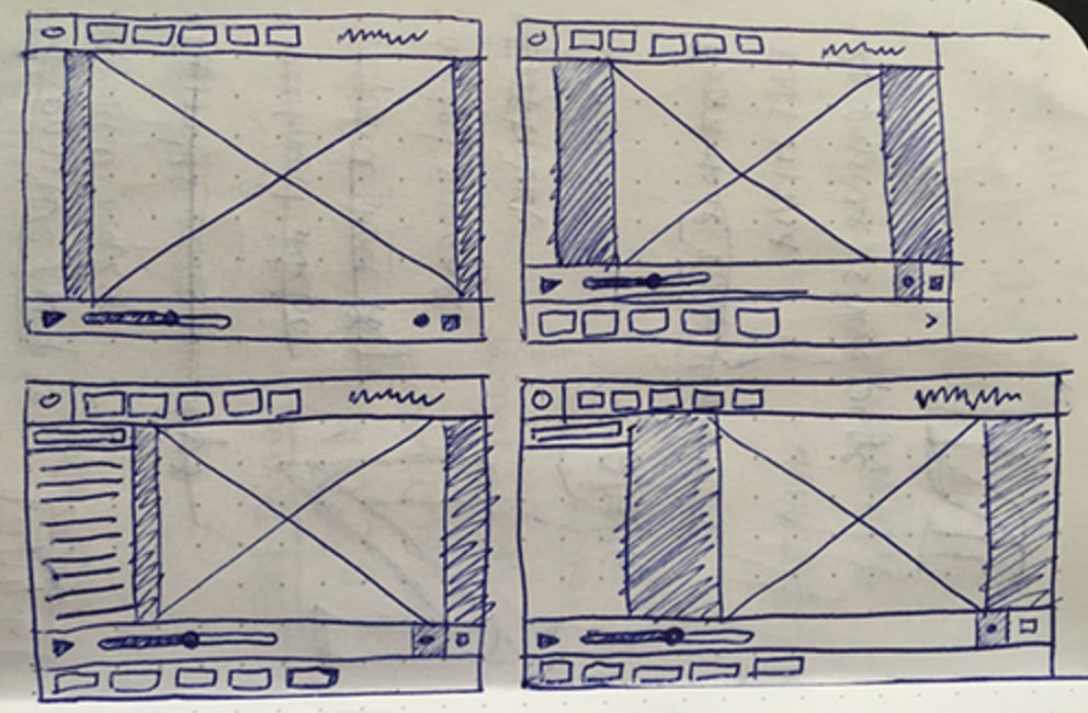
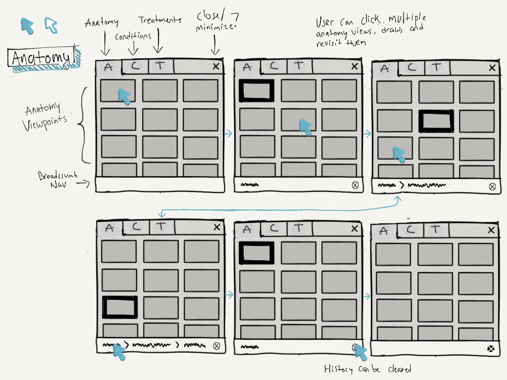
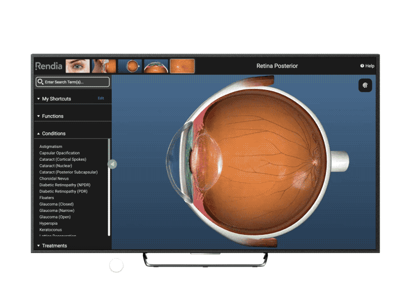
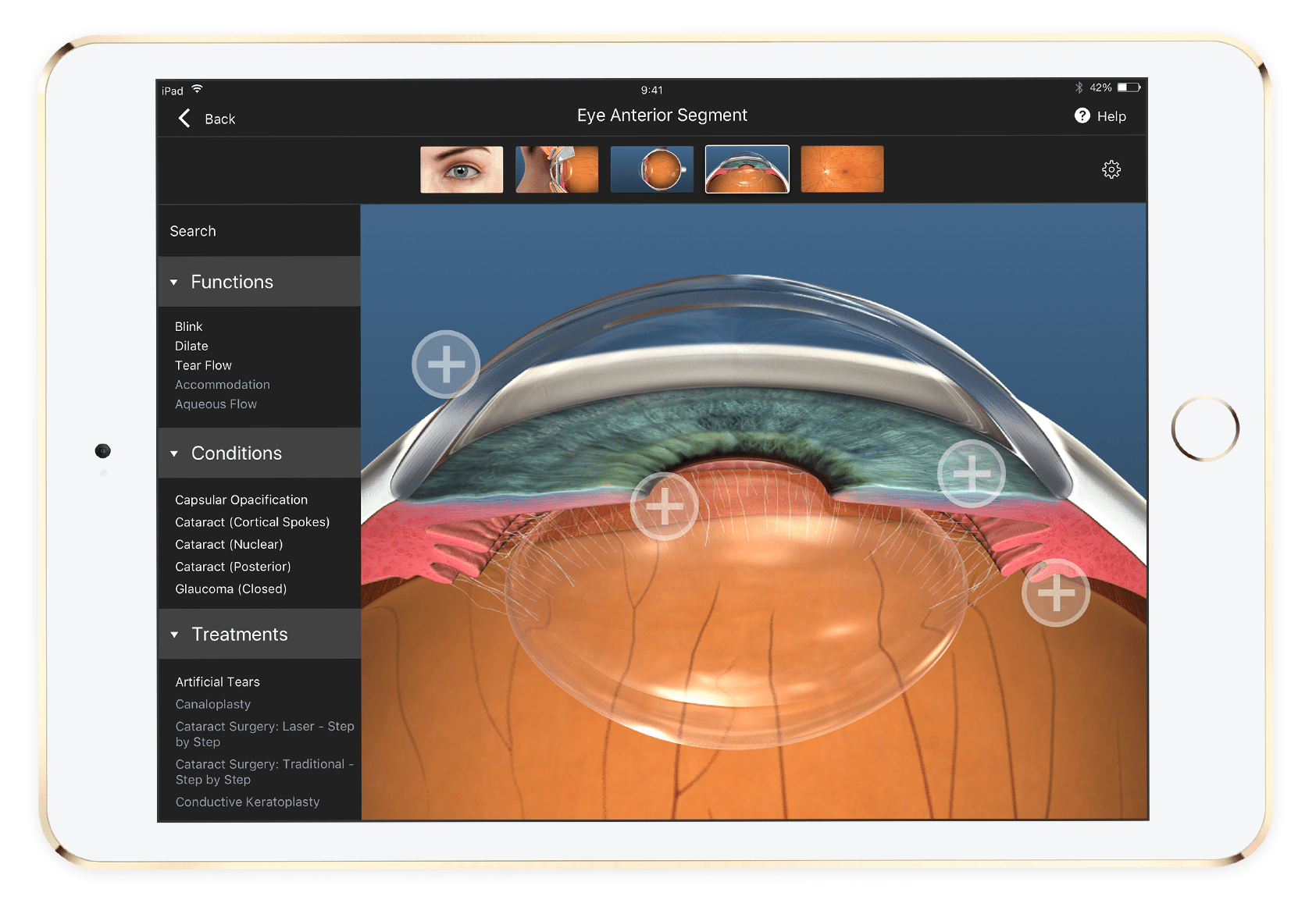
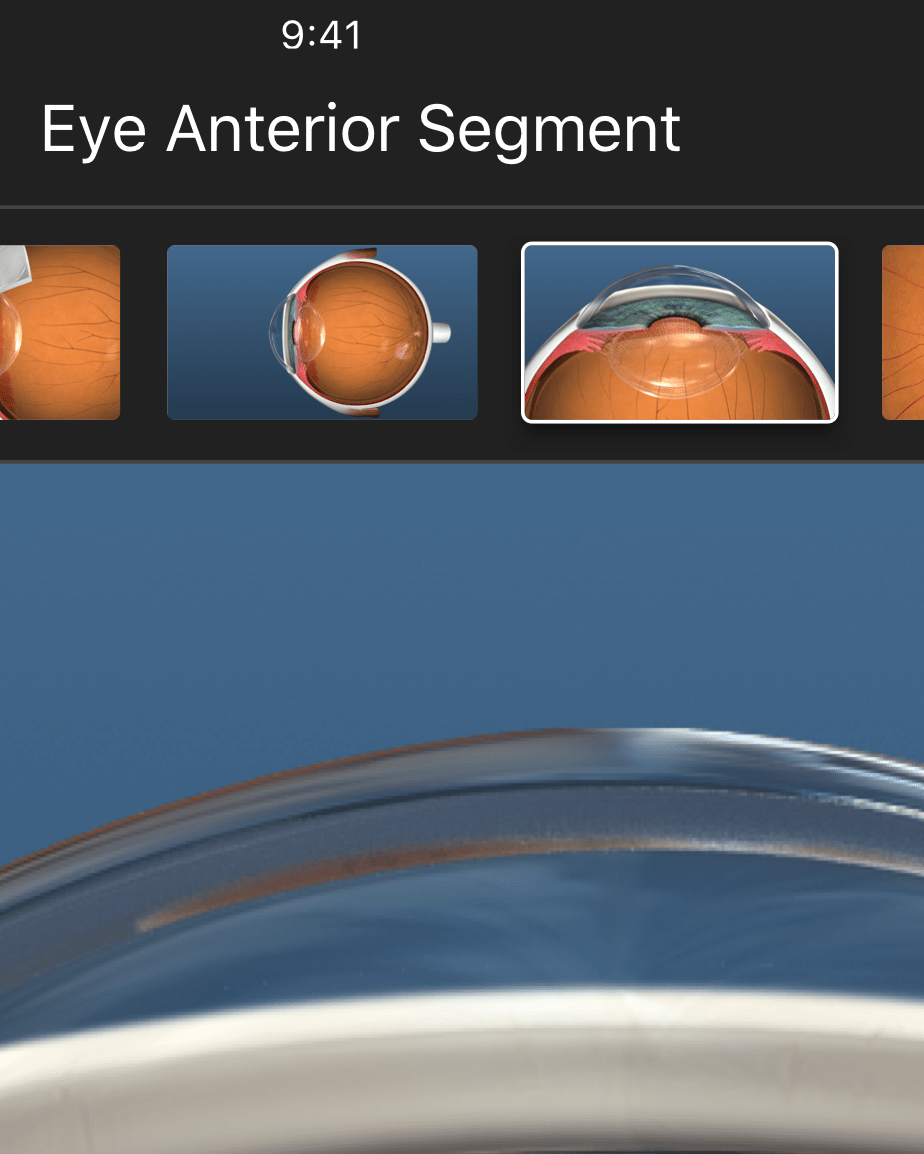
We chose to go with a horizontal menu bar at the top, holding thumbnails of five popular views. A left-hand sidebar contains searchable lists of conditions and treatments. This design was an efficient use of space and resembled common interaction patterns like sidebars and dropdowns, so it would feel familiar.
The biggest trade-off with this design was that our sidebar was divided into three lists, so searching and scrolling through each list was difficult on an iPad. The space was too small and fingers were too big. We tried to fix this issue by adjusting font size and the touch target size when on an iPad and making sections collapsible.
Motion
I explored ways to improve certain features and micro-interactions through motion studies and animations. This helped persuade project managers to focus their attention on the smaller details.
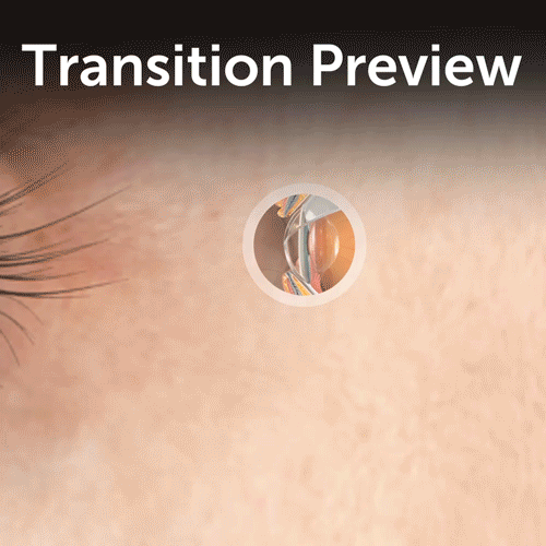
Desktop users could hover over hotspots to preview the transition
Views that required multiple transitions could benefit from a progress bar on the thumbnail
Prototypes
I used Framer to create realistic prototypes that mirrored end-product functionality. These prototypes gave users dynamic control like scrolling through lists and scrubbing through videos.
Testing
The prototypes above were used in our testing. We contacted a few of our current users who inquired on their own about the product to perform remote moderated usability testing. With this prototype, participants were asked to explain a concept like "Retinopathy of Prematurity" to us, as if we were patients, so we were able to observe exactly how doctors would use the product.
Results
I was involved in the conceptualizing, designing, and shipping of the web app and iPad app, as well as iteration on the product. Post-release, we continued to perform user testing to find usability issues. We also used tools like Inspectlet to watch user sessions—which gave us insight on how users navigated throughout the anatomy and we got to see how usability issues unfolded in real-time.
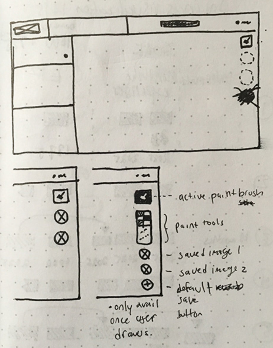
With this insight we added features such as drawing (highly requested from our customers), incorporated other videos (as prototyped above), and focused customization features.
Our designs proved to be a success based on customer feedback and an increase in sign-ups by new and current consumers.
The features in the app which fulfilled our goal of being quick, smart, and interactive were:
Making the most common views easily accessible and visible at the top of the app
Updating the searchable list of results showed the next most likely options, and options available on the current view through a visual distinction
Placing contextual hotspots on the viewing area so navigating the interface was intuitive by clicking where you wanted to go
Reflection
Being the sole designer gave me more exposure, responsibility, and taught me how to communicate effectively across teams. Customer outreach wasn't always available, so this trained me to make a concentrated approach while getting feedback. Showing work to others was valuable and led me to consult with PM's, devs, and other coworkers frequently to evaluate what flaws were in the design.
Looking back, there are a few things that I would've done differently:
Perform in-person usability tests, similar to the doctor visits we performed in the beginning. During testing, we set up video calls with our users, gauging the feasibility and effectiveness of the product. Seeing the app used first-hand, in the environment in which it would be used, with real patients, would've gave us better insight into the product's benefits and drawbacks.
Design with the developers. Because of our waterfall approach, developers weren't building as we were designing. Although designs were getting a thumbs up from the tech team, progress slowed as developers tried to manage video compression, quality, and speed, which was a necessary goal for the product.