Background
In the Fall of 2016, I was accepted into a graduate User Experience program at Maryland Institute College of Art. Over the course of 15 months, I gained experience with various aspects of UX design. My work consisted of open-ended projects that required problem-solving, conducting research, designing, testing, and analysis. My journey through the design process or for those also interested in the program, can be found on Medium.
Spotify TV - February 2017
In Technology Intensive, I redesigned the Spotify TV Interface. I loved the ability to stream Spotify from my TV although I was not of a fan of the UI which created real UX problems—the interface was exhausting to navigate.
This project allowed me to explore designing a 10-foot UI, an interface experienced from 10 feet away. I looked into TV screen design guidelines from Apple (tvOS), Google (Android TV), and Amazon (Fire TV).
I sent out a survey to redditors on r/spotify and got 98 responses providing me with insight on how listeners listened to their music, so that I could create a useful information architecture.
I also analyzed the current interface against heuristic standards, other apps like Hulu, Netflix, Amazon Video, and Apple TV, and saw where and why problems arose.
Horizontally scrolling required a lot of effort
Visual scanning was difficult, especially at 10 feet away
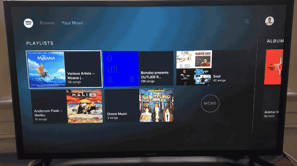
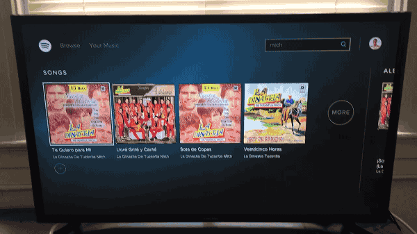
One solution was to create a grid layout, 6 columns wide. This layout was much easier to scroll through than a single line of items and there were always at least 12 items on screen. Multiple items in the top level of the hierarchy let listeners change categories quickly, as opposed to having a 'go back' button which was not advised in other design guidelines.
This prototype was made with Framer and used 4-way directional control to simulate using a remote.
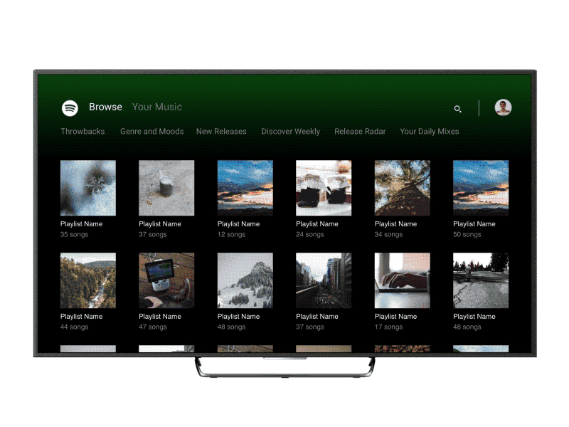
Listeners could see more albums, songs, and categories at any given time
Towing in Baltimore - April 2017
In our first Design Lab, we focused on learning about users. At the time, Baltimore city recently released FindMyTow, a web application that lets residents search for their towed car in an online database.
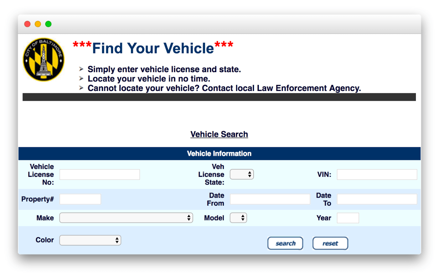
1. This experience is slow and frustrating to use, involves an unintuitive form that is difficult to fill in, and includes too many fields which cause information paralysis.
2. The site is not mobile friendly, which is crucial since people will likely only have their smartphone when finding out they've been towed.
3. The load times are also ridiculous because it loads all of the results and doesn't use any pagination.
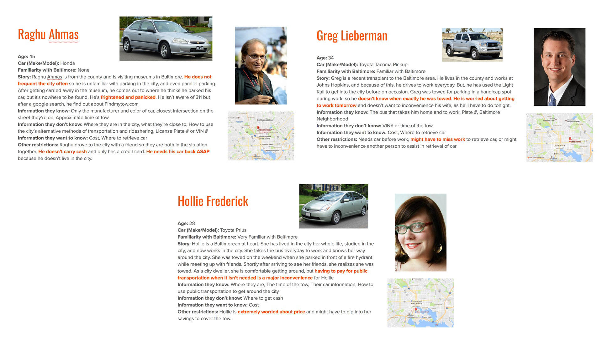
Luckily, I haven't experienced this firsthand so I decided to talk to people who have. I started discussions with people on r/Baltimore who wanted to share their stories and submit a survey.
I understood their emotional states, their thought processes while they were getting towed, and their mental models (what they knew and didn't know at the time regarding the towing process). Afterwards, I created a set of personas to understand user frustrations, situational limitations, and information they may or not possess.
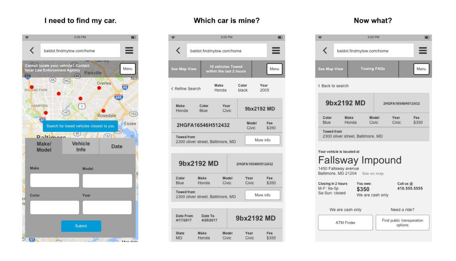
I proposed a solution that lets users enter only the necessary information to search for their car, shows them a visually scannable list so they can find their car, and a helpful information screen which lets them figure out what to do next.
1. Splitting up the make/model and the date/time they were towed lets the user perform a quicker search with the information they know—reducing information paralysis.
2. Results displayed in modular cards can adapt to show information about the car that the user will likely recognize—so displaying make/model first if that was searched for by the user.
3. The current towing website does not include information about the location of the lots, the fee, and the lot hours, which was crucial information that was only obtained after a phone call.
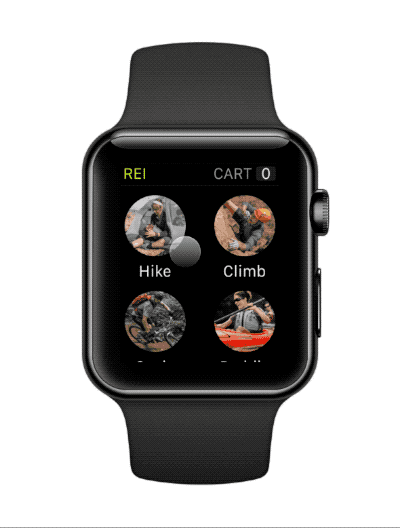
REI for the Apple Watch - October 2016
In Foundations of UX Design, I designed an watchOS interface after creating an information architecture based on a card-sorting exercise.
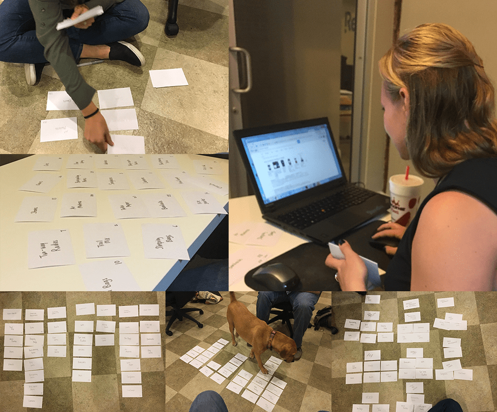
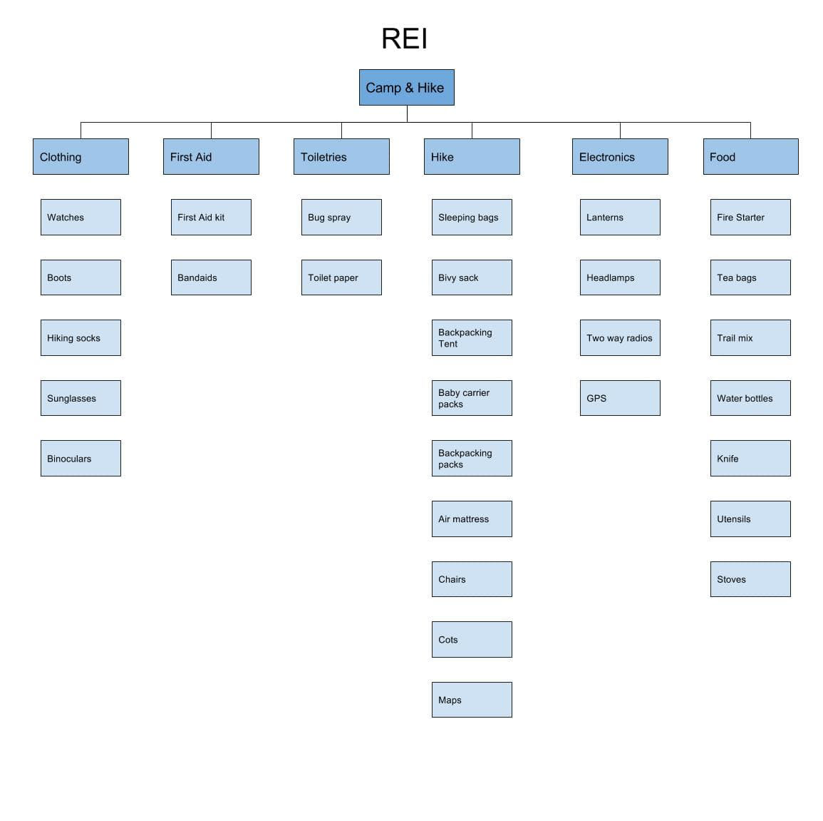
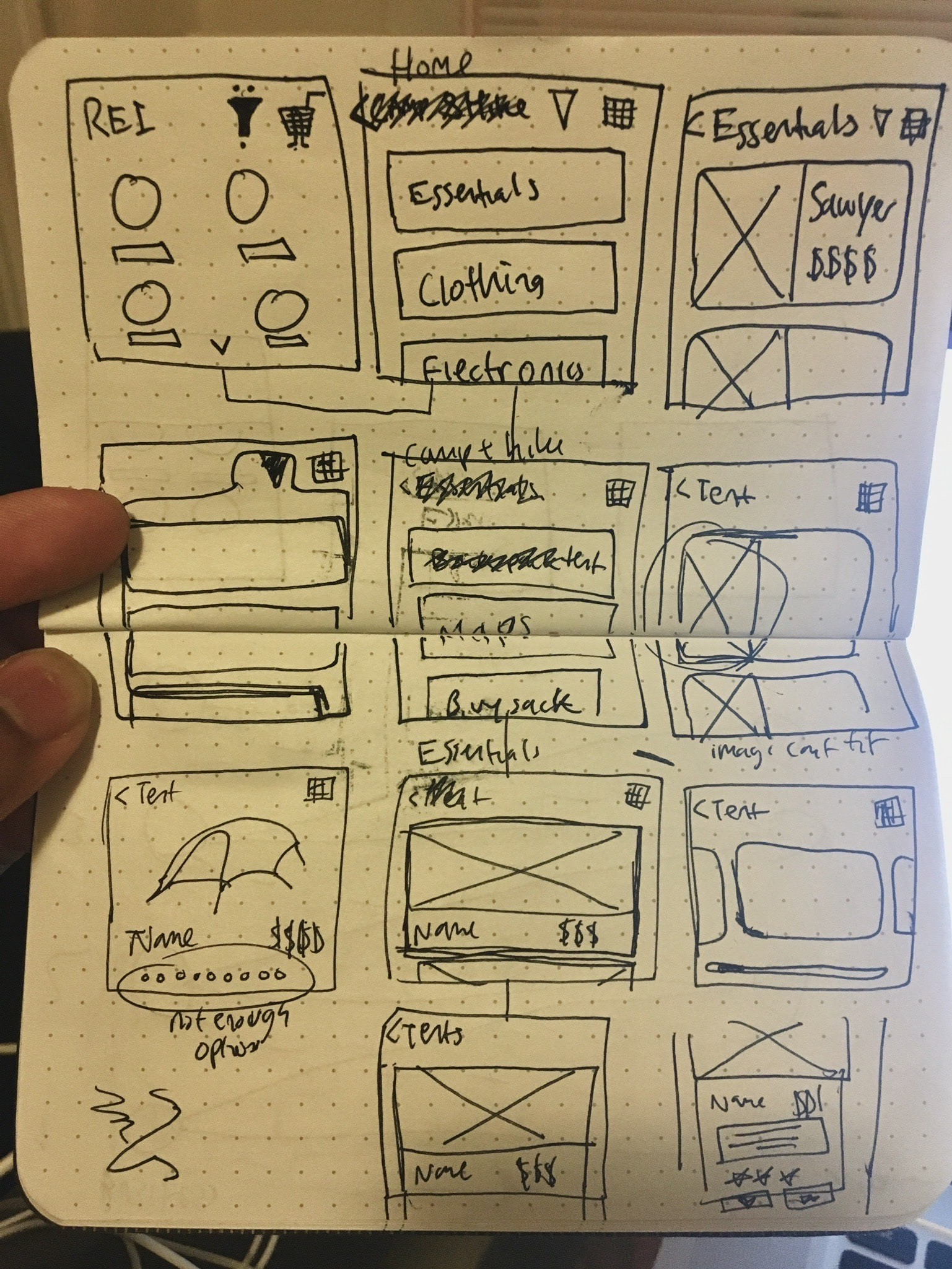
I collected all of the aspects of the REI website and let participants organize that information how they saw fit using notecards. This helped me create a new information architecture, which led to quick sketches of an interface and then an interactive Framer prototype.