Overview
This was my thesis project for the graduate UX program at MICA, the Maryland Institute College of Art, in 2017. Over the course of 8 weeks, we were tasked with finding a problem and applying UX principles to propose a solution. My project focused on creating an interaction pattern for missing functionality in a specific type of VR experience.
Problem
Narrative experiences told a story, informed, and educated users, primarily through the use of video and narration. Although well supported through smartphone VR, holding your phone an arm's length away, the experiences didn't scale up to headsets. Abilities to play/pause and select scenes were non-existent on many devices and this was due to a lack of standardization in design.
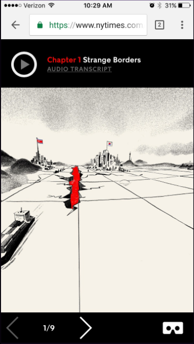
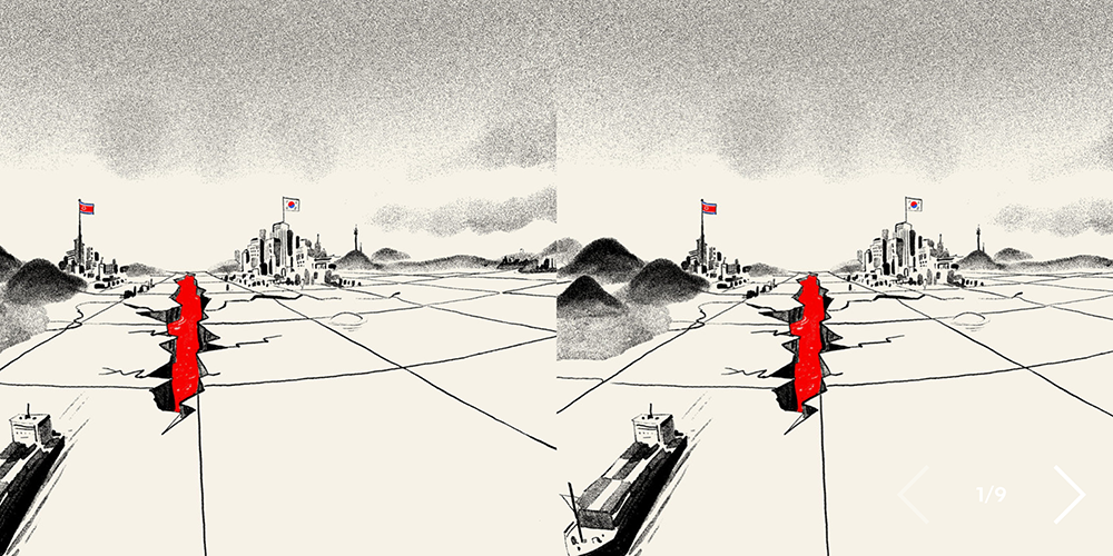
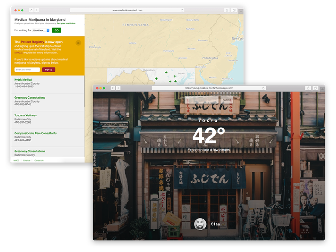
Both Stand At The Edge Of Geologic Time from NPR and My Trip to the DMZ from the NYT drop support for scene selection and play/pause when viewed with a headset.
Research
While trying out a variety of experiences to get a better understanding of the interaction landscape, I learned about 3 main types of menu designs:
1. Diegetic, meaning in the scene, was a type of menu that was located in the environment. For example, having to turn around and look towards the door marked 'exit'
2. Non-diegetic, not in the scene, is similar to a heads-up display (HUD) like in Iron Man—elements overlaid on screen
3. 2D menus were the most common and resembled the interfaces we see on 2D screens. These existed in the scene but were visually and physically separated from the environment
I also looked into guidelines from Google Cardboard/Daydream, Oculus, and Unity. I understood the usage of interaction patterns like reticles which give users feedback when hovering over items and fuse cursors which can make a selection for a user when controllers are not present. I also understood some of the human factors involved with designing VR experiences and physical constraints like neck strain and field of view.
Design
My design process was a deep dive into a variety of tools that helped me prototype and iterate on my initial idea.
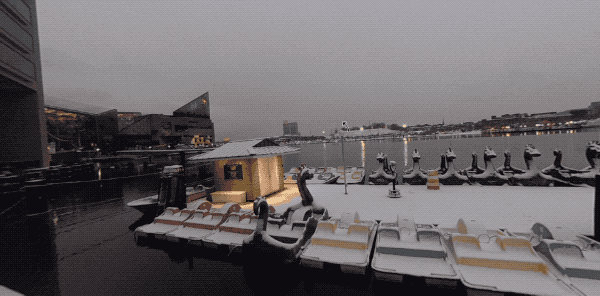
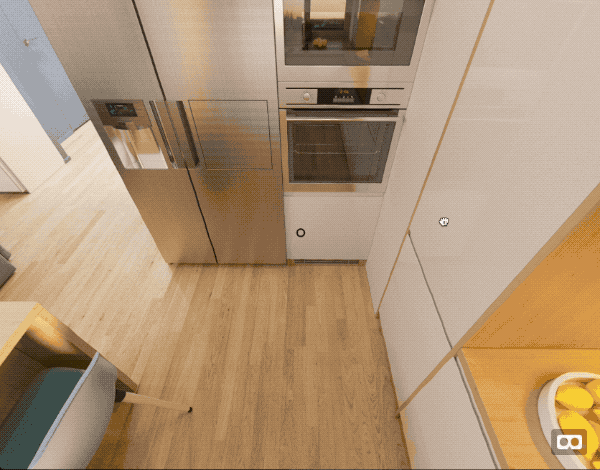
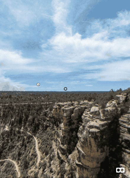
Looking down lets you read more information about the harbor's history
This physical space by the Inner Harbor in Baltimore was similar to the VR experiences that I was learning about. I'm able to look outwards at the water and then look down at the sign to get more information. I took a 360-degree image with my Ricoh Theta camera and viewed it in a headset to imagine what this virtual experience would feel like.
I used Google Blocks to place shapes around the scene and saw the impact of an element's distance. I saw that objects up close can make you feel claustrophobic while placing them farther away can make them feel out of reach.
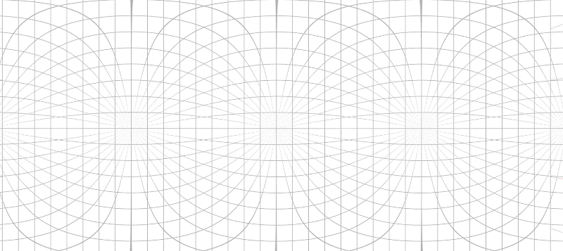
Using photoshop, I started with an image of an equirectangular grid and turned it into a panorama. I could rotate around the scene, draw UIs with the pen tool, and then continue rotating as if that element was in 3D space. This let me narrow in on how and where elements should be placed in the scene.
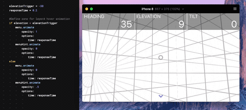
Framer let me test specific characteristics of the interaction. Using the degree of a device's rotation I could see how far a user needed to look before showing the menu.
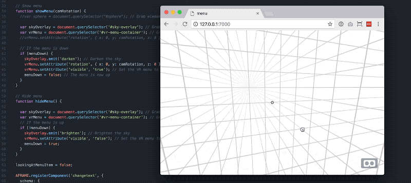
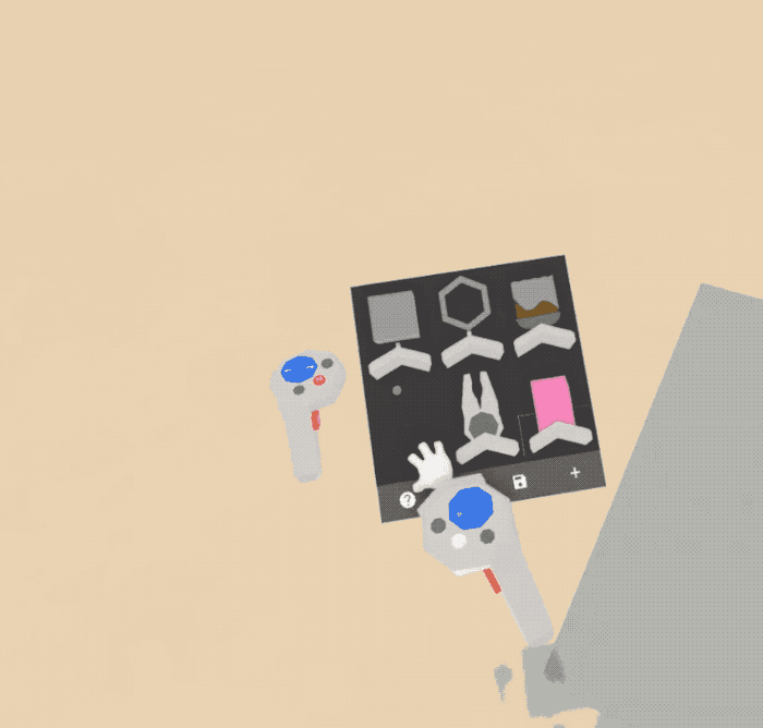
Aframe, a javascript library for creating VR experiences, HTML, and CSS were used to make the testable prototypes. This let me make a much higher fidelity prototype that included text and fluid interactions.
I made two prototypes to test with, each with multiple variations in layout and characteristics of the interaction. The first was an 'I Spy' game where users needed to find items around the room and could look down to see the remaining items.
In this prototype I learned how important the field of view was. Originally, menu items were horizontally aligned. Although the items were still in the field of view, items on the edge were in the peripheral zone and were hard to focus on. I found that a centered grid layout kept everything completely in focus.
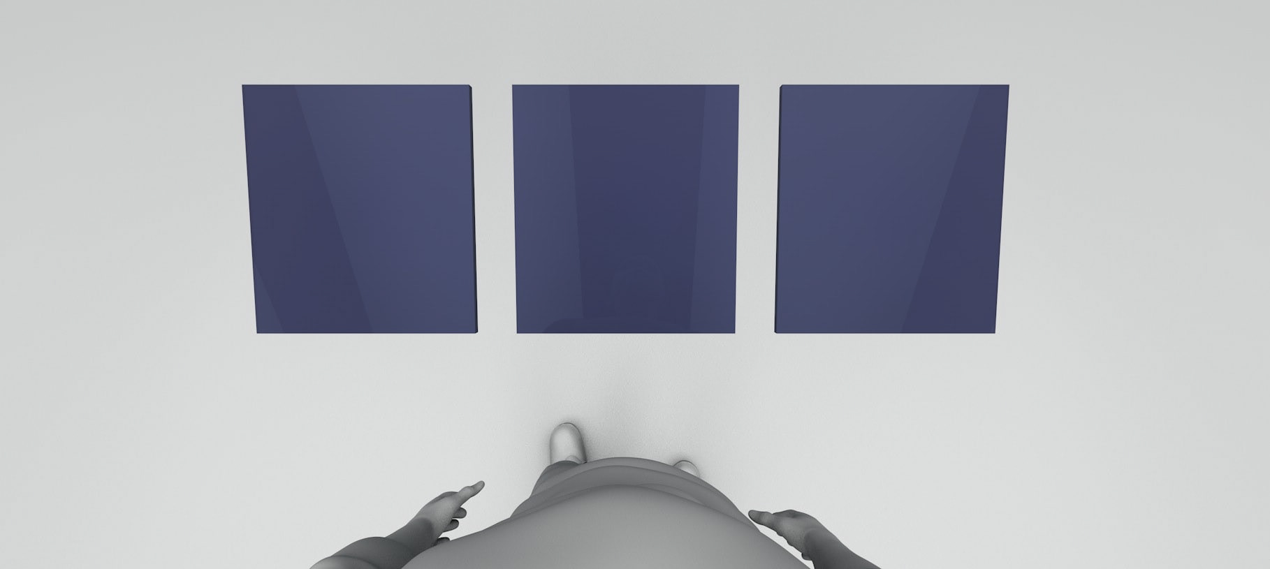
The second prototype was a picture viewer where you could see three different images and look down to see a menu of other scenes.
In this prototype I learned about a human factors aspect to VR interactions. Originally, I kept the menu locked in one location. When users were facing away from the menu, they needed to turn their head, and sometimes their body to see the menu. This required more effort and increased the interaction cost. The solution was to have the menu appear in front of them whenever and wherever they looked down.
Testing
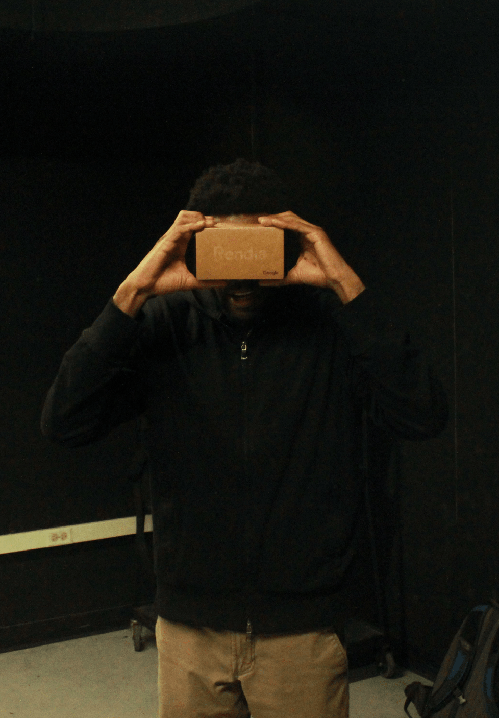
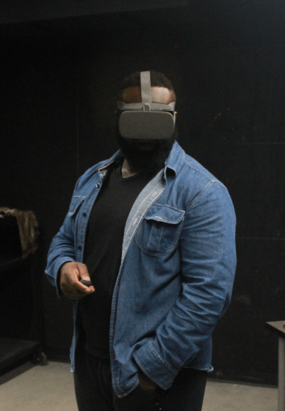
I performed in-person usability tests to gauge the effectiveness of the designs. I received a funding grant from the Graduate Research Development Grant Committee at MICA so that I could pay testers a financial compensation. I reached out to local groups like UX Baltimore and Free Code Camp in order to find participants. I tested with 5 users, which lasted about 30 minutes each, and I watched them interact with the prototype while asking them questions.
Seeing the experience gave me insight I otherwise wouldn't have gotten. I saw users have to move their entire body while turning to face the menu which was a lot of effort. I saw their necks bend as they looked down in order to focus on the menu. These learnings helped alter the visual interface.
The Workstation
The workstation is a head-tracked interaction which brings up an interface that helps users access a set of controls or secondary information.
It was important to keep the interaction accessible and readable:
1. The action of 'looking down' can be hinted to through affordances, similar to how websites have a 'scroll down' icon in the hero section of the site
2. It's advised to keep the menu low and out of the way, but be aware that users may be sitting down so their neck movements are limited
3. Dimming the scene helps the user focus on the menu and this technique follows the game design principle of 'guiding users with light'
4. Keeping content well within the field of view helps the user avoid exerting extra effort which would increase the friction with the experience. Always keep the workstation in front of the user when the user looks down. The workstation may move with the user only if the items in the menu just need to be read, not selected or interacted with
Implementing the Workstation
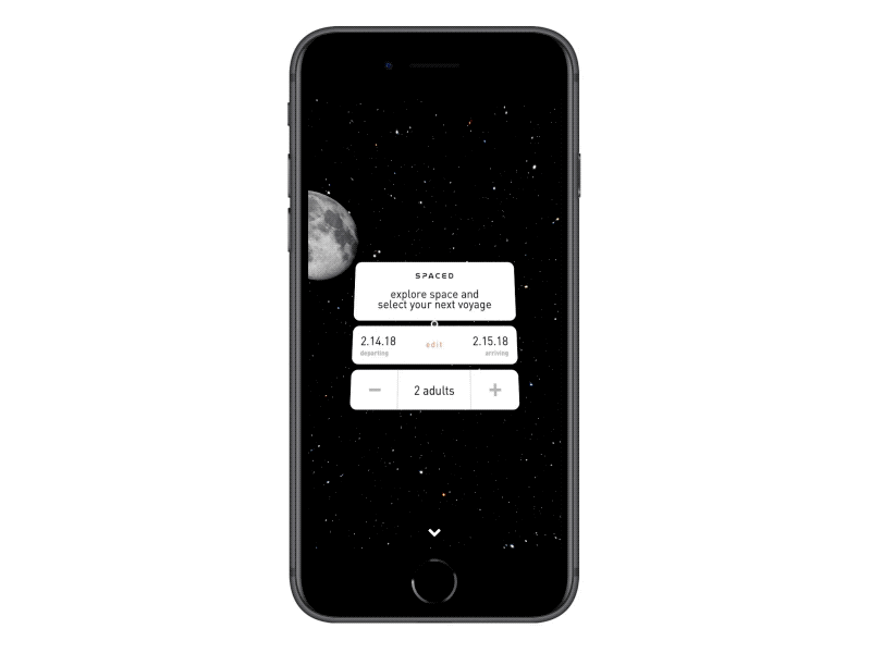
I used this design pattern when submitting an app prototype to Dann Petty's SPACED challenge.
The SPACED challenge involved proposing an app design for a fictional space travel company. I used Framer to create an experience that allowed the user to look around "space", select a planet, and then customize the flight. While rotating, the user could look down to bring up the workstation, a 2D menu interface containing flight attributes like dates and number of passengers.